
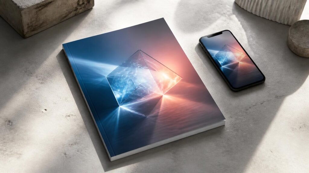
Quick answer: Effective technology magazine covers combine bold typography, one striking image, deliberate color choices, and a clear visual hierarchy so readers grasp the story in a single glance. The best covers work twice: as a physical object on a newsstand and as a small thumbnail on Instagram, Apple News, or a Google search result. As design shifts toward minimalism, AI-generated imagery, and data-driven testing, the covers that win are the ones that pair strong aesthetics with an unmistakable message.
A magazine cover has roughly two seconds to convince someone to pick it up, click on it, or scroll past it. For technology publications, that brief window carries extra weight. These covers don’t just sell an issue. They signal what’s next in an industry defined by constant change, often shaping public perception of entire technologies before readers open to page one.
Think about the covers that defined eras of tech culture. WIRED’s neon-soaked, fluorescent-ink aesthetic in the 1990s announced the internet’s cultural takeover before most households were online. Time’s red-bordered frame turned the personal computer into its 1982 Machine of the Year, and later gave readers a literal mirror on its Person of the Year cover. These images became cultural touchstones because they translated abstract, often intimidating concepts into something visual and immediate.
Today the stakes look different but remain just as high. A cover must work as a physical product on a newsstand and as a tiny thumbnail in a social feed. This guide breaks down how technology magazine covers have evolved, which elements make them effective, which design trends are shaping them now, how cover design affects engagement and sales, and where the craft is headed next. Whether you are a designer, editor, publisher, or simply a fan of great editorial design, you will find practical takeaways throughout.
How Have Technology Magazine Covers Evolved Over Time?
Technology magazine cover design has moved through four broad phases, each shaped by the way readers actually found and consumed media.
Phase 1: The practical-tool era
Early technology magazine covers, from Popular Science (founded in 1872) to Byte (launched in 1975), favored simplicity. Basic typography, straightforward product photography, and minimal color palettes dominated the newsstand. The goal was informational clarity rather than emotional impact. Technology was presented as a practical tool for hobbyists and professionals, not as a lifestyle statement. Covers often listed several article topics so that readers could see exactly what they were buying.
Phase 2: The personal computing boom
As computers moved into homes and offices during the 1980s, covers began to sell excitement alongside information. Product photography became more polished, and publications such as Time elevated the computer to a subject of mainstream cultural importance. Covers started to speak to general readers, not only enthusiasts.
Phase 3: The internet-age experiment
The launch of WIRED in 1993 changed the visual language of technology media. Experimental layouts, saturated colors, unconventional typography, and layered imagery made the cover itself a statement about the digital future. For many readers, the design communicated the attitude of the era as much as the headlines did.
Phase 4: The thumbnail era
The shift toward digital publishing changed everything. As readers moved from print racks to browser tabs and social feeds, covers had to function at drastically smaller sizes and compete against an endless stream of other content. Designers responded by simplifying in some ways while amplifying visual drama in others. Bold single images replaced cluttered layouts. Cover lines were cut back, and headlines grew larger and punchier to stay legible at thumbnail size.
Current trends reflect this hybrid pressure. Minimalist compositions, oversized typography, and single striking images now dominate technology magazine covers. This approach respects the realities of digital consumption while still delivering the visual punch needed to stand out in a crowded market, whether that market is a physical shelf or a scrolling feed.
What Elements Make a Technology Magazine Cover Effective?
Effective technology magazine covers share several consistent characteristics, regardless of publication or design philosophy.
1. Eye-catching visuals
Eye-catching visuals anchor every successful cover. Whether it’s a dramatic product shot, an abstract representation of a concept like artificial intelligence, or a striking portrait, the central image must arrest attention before a reader processes any text at all. Strong cover images usually share three traits: a single clear focal point, high contrast between subject and background, and an idea that can be understood without a caption.
2. Compelling headlines and cover lines
Compelling headlines work alongside the imagery to convey innovation and relevance. The best technology cover lines avoid jargon and use language that signals stakes and significance. A headline doesn’t need to explain the story. It needs to create enough curiosity that the reader wants to find out more. Short, active, specific wording tends to outperform vague or overly clever phrasing, especially at small sizes.
3. Color psychology
Color plays a strategic role. Designers choose palettes deliberately, not decoratively:
- Blue and white often signal trust, stability, and clarity, and are common on enterprise and security stories.
- Red and orange create urgency and are frequently used for disruption, controversy, or breaking news.
- Green has become shorthand for sustainability, clean energy, and climate tech.
- Black with neon accents suggests cutting-edge, futuristic, or gaming-related subjects.
- Bright, saturated single-color backgrounds help a cover pop in a crowded feed.
4. Brand identity integration
Brand identity integration ensures a cover is instantly recognizable as belonging to its publication, even while telling a unique visual story each issue. WIRED’s distinctive typographic style, for example, remains identifiable across radically different cover concepts. A consistent masthead position, a signature typeface, and a recognizable color system build the kind of familiarity that brings loyal readers back.
5. Clear visual hierarchy
Hierarchy tells the eye where to look first, second, and third. On the strongest covers, the reader moves from image to headline to supporting text without effort. When everything competes for attention, nothing wins it.
What Design Trends Are Shaping Technology Magazine Covers Today?
Several themes recur across recent technology magazine covers, reflecting broader shifts in the industry itself.
Artificial intelligence as the dominant subject
Artificial intelligence dominates current cover subject matter, often visualized through abstract digital imagery, humanoid figures, glowing neural-network graphics, or surreal composites. Because AI has become so central to technology journalism, the challenge for designers is differentiation. When every competitor uses a glowing brain or a robot hand, the covers that stand out are the ones that find a fresh metaphor.
Sustainability and green tech
Sustainability and green-tech themes have also grown more prominent. Covers increasingly feature natural imagery juxtaposed against technological elements, visually reinforcing the tension and partnership between innovation and environmental responsibility.
Human-centered design
Human-centered design marks another significant shift. Rather than focusing exclusively on devices or abstract concepts, more covers now foreground diverse human faces and stories. This reflects a broader push toward representation in tech media and acknowledges that technology’s impact is fundamentally a human story.
Minimalism and oversized type
Minimalist layouts with generous negative space and very large typography are well suited to small screens. They also give a cover a modern, confident tone that suits technology brands.
Interactive and augmented reality elements
Some publications have experimented with interactive and augmented reality features, allowing print readers to scan covers for supplementary digital content. While not yet mainstream, this approach points toward a more blended future between print and digital experiences.
Bold experimentation with generative imagery
Generative tools now let art directors produce striking, surreal, or highly stylized visuals quickly. Used thoughtfully, they open creative doors. Used carelessly, they can make covers look generic or raise questions about originality, which is why many editors are developing clear policies around when and how AI imagery appears.
How Does Cover Design Affect Reader Engagement and Sales?
Cover design directly influences purchasing decisions, particularly for newsstand sales where readers make split-second choices among competing titles. A cover that clearly communicates value and relevance outperforms one that relies on abstract artistry alone.
Social media amplification
Social media has amplified this effect substantially. A striking cover can generate significant organic engagement when shared, functioning as free advertising well beyond a publication’s direct subscriber base. Covers designed with shareability in mind, featuring bold visuals that work at small sizes, tend to earn more cross-platform reach.
The psychology behind the pick-up
Psychological factors drive reader interest in predictable ways:
- Curiosity gaps: a headline that suggests valuable information without fully revealing it reliably draws readers in.
- Familiar faces: tech executives, founders, and cultural figures generate recognition-based interest.
- Contrast: whether visual or conceptual, contrast catches the eye more effectively than uniformity.
- Emotional resonance: covers that evoke wonder, concern, or surprise are more memorable than purely informational ones.
Data-informed cover decisions
Publishers increasingly rely on A/B testing for digital cover variants, measuring click-through rates across different headline phrasings or image choices before finalizing a print edition. This data-informed approach has made cover design less a matter of pure artistic instinct and more an iterative, evidence-based process. The most effective teams combine analytics with editorial judgment, using the numbers to refine ideas rather than replace creativity.
What Are the Best Practices for Designing Technology Magazine Covers?
Strong technology magazine covers balance several competing priorities at once. Use the following principles as a working framework.
Balance aesthetics with readability
A visually stunning cover that obscures its headline or buries key information defeats its own purpose. Designers achieve balance by establishing clear visual hierarchy, ensuring the eye moves naturally from image to headline to supporting text.
Use white space deliberately
White space remains an underrated design tool. Rather than filling every inch with content, effective covers use negative space strategically, giving key elements room to breathe and preventing the clutter that overwhelms readers.
Choose typography with intent
Typography communicates as much as the words themselves. Bold, modern sans-serif fonts tend to convey innovation and authority, which explains their dominance across technology publications. Serif fonts, by contrast, can signal tradition or gravity, which is useful for serious or investigative tech stories.
Invest in photography and illustration
High-contrast lighting, unconventional angles, and bold color grading all help technology covers stand apart from conventional editorial photography. Custom illustration and 3D rendering can also express abstract concepts such as data, cybersecurity, or machine learning that photography struggles to show.
Design for the smallest size first
Before finalizing a cover, shrink it to roughly the size of a social media thumbnail. If the main image and the headline are still clear, the design is working. If not, simplify.
Common mistakes to avoid
- Crowding the cover with too many cover lines.
- Using low-contrast text over busy images.
- Relying on clichéd tech imagery such as circuit boards, binary code, or glowing blue brains.
- Ignoring how the masthead and image interact.
- Skipping thumbnail testing before publication.
Quick cover design checklist
- Is there one clear focal point?
- Is the main headline readable at thumbnail size?
- Does the color palette match the story’s tone?
- Does the cover feel unmistakably like your brand?
- Is there enough negative space to let the key elements breathe?
- Does the cover create curiosity without being misleading?
What’s Next for Technology Magazine Cover Design?
Looking ahead, several emerging trends seem poised to reshape technology magazine covers further.
Personalization represents perhaps the most significant shift. As more readers access magazines through digital subscriptions, publishers have begun experimenting with dynamic covers tailored to individual reader interests or browsing history, a concept impossible in traditional print distribution.
Multimedia integration will likely deepen as well, with covers increasingly serving as gateways to video content, interactive graphics, or supplementary digital features rather than standalone static images.
Artificial intelligence in the design workflow will probably play a growing role in cover creation, from AI-generated imagery and layout suggestions to predictive tools that help designers anticipate which visual choices will perform best with target audiences. This raises interesting questions about authorship and originality, but it also offers designers powerful new tools for rapid iteration.
Sustainable production is another area to watch. Print publishers are exploring recycled papers, vegetable-based inks, and lower-waste finishes, and these choices increasingly appear as part of a magazine’s brand story.
Designing Covers That Capture Attention
Technology magazine covers function as more than marketing tools. They are cultural artifacts that capture how society understands and relates to innovation at any given moment. The strongest covers balance timeless design principles, like visual hierarchy, strategic color use, and compelling typography, with an acute awareness of how readers actually encounter media today, whether on a newsstand or a smartphone screen.
For publishers and designers, the path forward involves continued experimentation: testing what resonates, staying attuned to emerging trends like AI-generated imagery and dynamic personalization, and never losing sight of the fundamental goal of a cover, which is to tell a complete story in a single, unforgettable image.
Frequently Asked Questions
What makes a technology magazine cover effective?
An effective technology magazine cover combines a striking central image, a clear and compelling headline, and strategic color choices that evoke the right emotional response, all while maintaining strong brand identity and visual hierarchy.
How has digital publishing changed technology magazine cover design?
Digital publishing has pushed designers toward bolder, simpler compositions that remain legible at thumbnail size, since covers now need to perform well on social media and digital newsstands, not just physical shelves.
Why do so many technology magazine covers currently feature AI themes?
Artificial intelligence has become one of the most significant and widely covered developments in the technology industry, making it a natural and frequent subject for cover imagery and headlines.
Does cover design actually affect magazine sales?
Yes. Cover design directly influences newsstand purchasing decisions and social media shareability, with publishers increasingly using data and A/B testing to refine cover choices before publication.
Which colors work best on technology magazine covers?
There is no single best color. Blue and white suggest trust, red and orange suggest urgency, green signals sustainability, and dark backgrounds with bright accents suggest futuristic themes. The right choice depends on the story and the brand.
How can designers test whether a cover will work at thumbnail size?
Shrink the cover to the size it will appear on social platforms and check whether the main image and headline are still clear. Many publishers also run A/B tests on digital versions before committing to a print design.
What design trends will shape technology magazine covers in the future?
Personalization for digital subscribers, deeper multimedia integration, and AI-assisted design tools are expected to significantly influence how technology magazine covers are created and presented going forward.